Charts and graphs are a great way to visualize data and make your documents in Google Docs more appealing and easy to understand.
Inserting a Chart
Inserting a chart in Google Docs is simple:
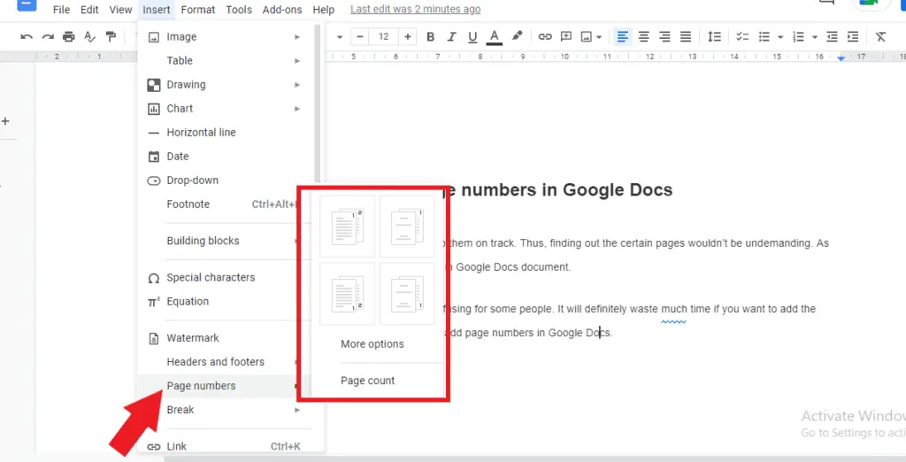
- Click Insert > Chart in the Google Docs menu.
- Select the type of chart you want to insert from the options:
- Bar chart
- Column chart
- Line chart
- Pie chart
- More charts (additional options)
- A chart will be inserted into your document with sample data.
Once inserted, you can customize and edit the chart to your needs.
Editing the Chart Data
When you insert a chart, it comes prepopulated with sample data. To edit the data:
- Click the Edit in sheets link on the bottom left of the inserted chart. This will open the connected Google Sheet containing the chart’s data.
- Replace the sample data with your own data. The chart in your Google Doc will update automatically to reflect the new data.
You can continue editing the chart data in the connected Sheet to update the chart in real-time.
Changing the Chart Type
To change the type of chart:
- Click on the chart to select it.
- Click the Chart editor icon in the toolbar.
- In the editor sidebar, select the Customize tab.
- Under Type, click the dropdown and select a new chart type.
The chart will update to the new type using your existing data.
Customizing and Formatting the Chart
The Chart editor sidebar provides options to customize various aspects of your chart:
- Setup: Change the chart type, data range, legend position, etc.
- Customize: Edit titles, axes, data labels, colors, and more
- Color: Change background, font, and data colors
Use these options to tweak the chart to your preferences.
Some key customizations:
- Add chart and axis titles: Descriptive titles help viewers understand your data.
- Show data labels: Display values on data points.
- Change legend position: Move legend to bottom, right, left, etc.
- Switch row/column data: Transform data from rows to columns or vice versa.
Resizing and Positioning the Chart
To move or resize a chart:
- Click on the border of the chart to select it.
- Drag and move the chart to reposition it.
- Drag the sizing handles on the sides and corners to resize.
Tip: Hold shift while resizing to retain proportionate dimensions.
Linking the Chart to a Sheet
By default, Google Docs charts are linked to an associated Google Sheet containing the chart’s data. This linking enables automatic updates but can be changed.
To edit the link:
- Click the Link icon on the top right of the chart.
- Choose Open source to edit the linked Sheet.
- Select Unlink to break linkage so data updates don’t change the chart.
Adding Alternative Text
Charts should have alternative text descriptions to assist viewers using screen readers.
To add alt text:
- Right-click the chart.
- Choose Alternative text.
- Enter a thorough text description of the chart data and trends.
Exporting a Chart
Finished charts can be exported out of Google Docs:
- Copy and paste the chart into other documents or slides.
- Download the chart as a .PNG graphics file.
- Print the chart along with your document.
Chart Types
Google Docs supports various chart types to visualize different kinds of data:
Column Charts
Column charts use vertical bars to compare data points across categories. Useful for:
- Displaying changes over time
- Comparing quantities
- Showing data in discrete categories
Column Chart
Bar Charts
Bar charts use horizontal bars to compare data categories. Helpful for:
- Comparing quantities in large category sets
- Highlighting differences across items
Bar Chart
Line Charts
Line charts display trends and progressions over time as a line. Ideal for:
- Tracking continuous data
- Showing increases/decreases
- Visualizing projections
Line Chart
Pie Charts
Pie charts demonstrate proportional data as slices of a circle. Useful when:
- Displaying part-to-whole relationships
- Highlighting distribution
- Simplifying percentages
Pie Chart
Scatter Plots
Scatter plots use dots to represent values to show correlation between variables. Helpful for:
- Identifying trends and patterns
- Assessing connections
- Predicting outcomes
Scatter Plot
The above are just a few examples. Google Docs contains several other chart types including area, combo, histogram, timeline, and more. Choose the one most appropriate for your data!
Tips for Better Charts
Follow these tips to create effective, easy-to-understand charts:
Clearly Label Your Data
- Give your chart a descriptive main title
- Label the x and y axes concisely
- Show data values directly on chart
- Use a legend to define data series
Maintain Data Integrity
- Ensure your data is accurate and complete
- Avoid excessive data points or categories
- Only show relevant data in the chart
Choose Appropriate Visuals
- Select the right chart type for your data
- Use colors intentionally and minimally
- Include demarcation lines sparingly
- Keep ornamental elements minimal
Make Responsively Sized Charts
- Avoid overly large or small charts
- Preview how chart appears on mobile devices
- Be ready to resize chart for legibility
Provide Alternative Text
- Add a detailed alt text description
- Ensure text includes main data points
- Alt text makes charts accessible
By following best practices, you can create professional, publication-ready charts and graphs directly in Google Docs.


