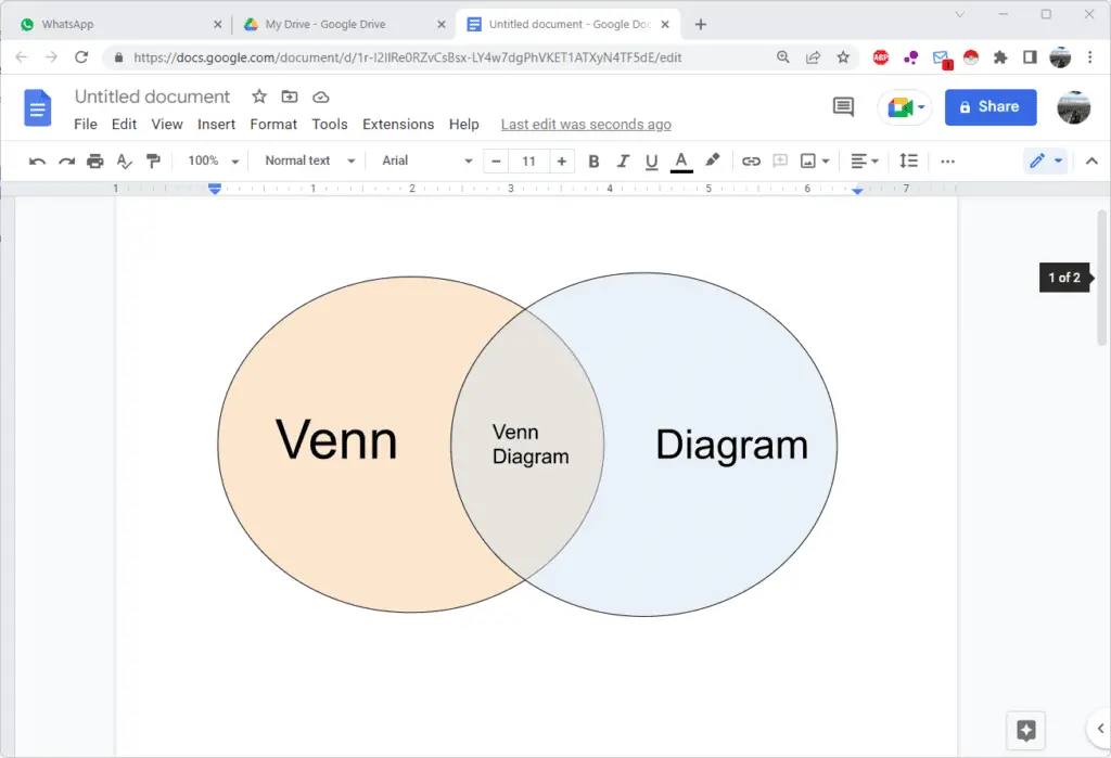
Venn diagrams are circles that overlap to show how things are alike or different.
Why are they called Venn diagrams? They were introduced in 1880 by John Venn, a mathematician, and philosopher. He didn’t call them Venn diagrams, but they were named after him.
To start, you want to have at least two topics. But you can use more than two circles. For example, if you wanted to make fancy Venn diagrams with three things or three circles, make sure that they all overlapped, and then the part in the middle is the thing that all three circles have in common.
1. Go to Insert > Drawing > New.

2. Select whatever shape you want for your diagram. In this tutorial, we’re going to use oval.
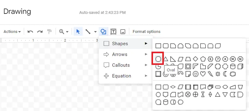
3. Create two circles so they’re overlapping. You can do three, four, or more if you want to.
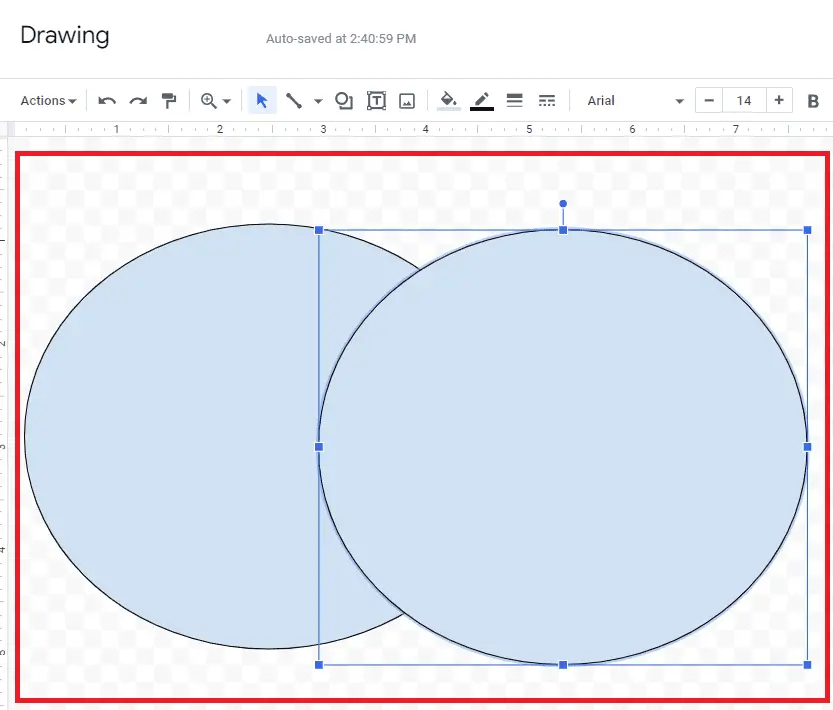
4. Now change the color of the first circle by clicking the Fill color icon.
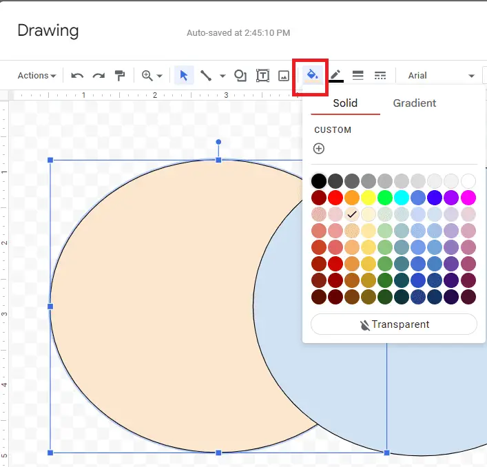
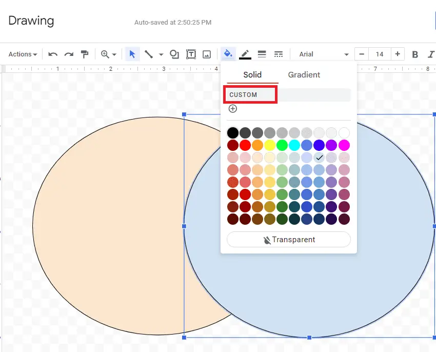
5. For the second circle, you can change the color if you want. But the important thing is to make it a little bit transparent. Again, click Fill color and select Custom.
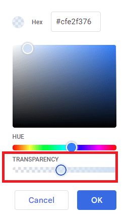
6. In the Transparency bar on the bottom, move that slider to about halfway or around 50 percent. That way you can see the other line of the circle.
7. Now add text to them using the Text box tool.
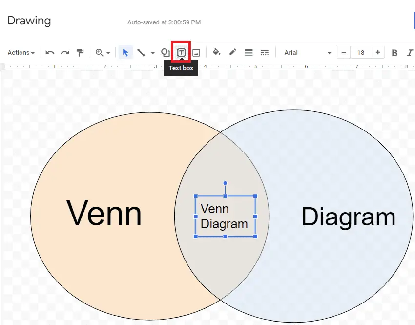
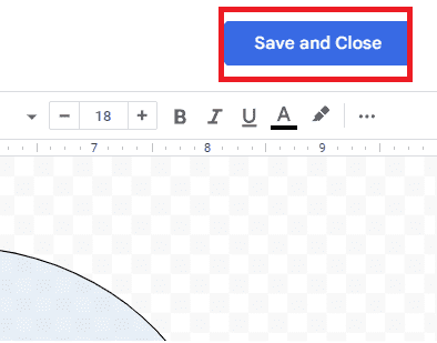
8. Once you have all of your text added to your diagram, hit Save and Close to finish.
And this is how you do Venn diagrams on Google Docs but with your data in it.

