Google Docs provides a bunch of features that are simply useful for business data. It is appropriate with most presentation software and word processor applications. One of the features that you can obtain on Google Docs is creating a graph.
The graph is required for data visualization or models to intensify your presentation, resumes, and reports. There are some steps that you need to consider for how to make a graph on Google Docs.
Creating a Graph on Google Docs
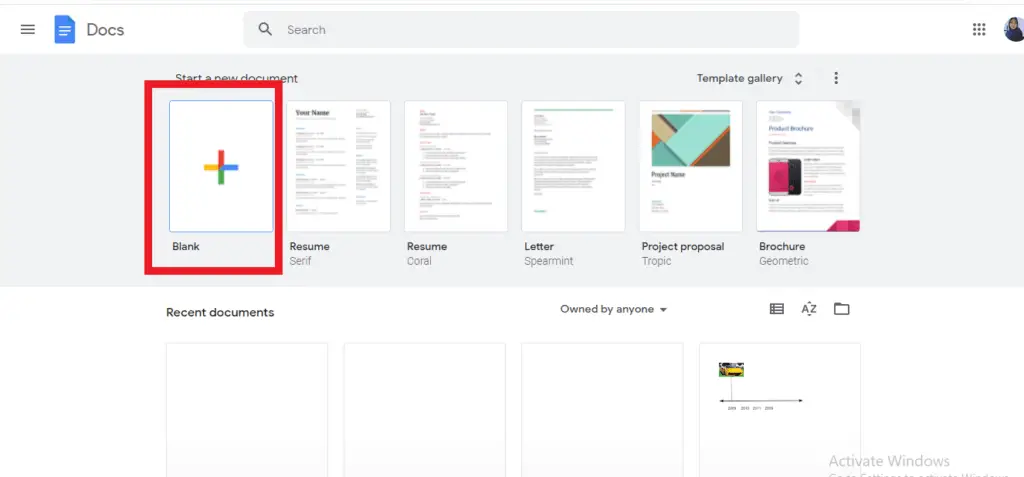
1. Google docs allow you to create a graph or chart in your document. You may open your document first that requires a graph, either by selecting an existing one or creating a new one. Click the “Blank” option in order to make the new one.
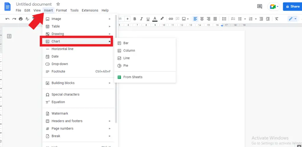
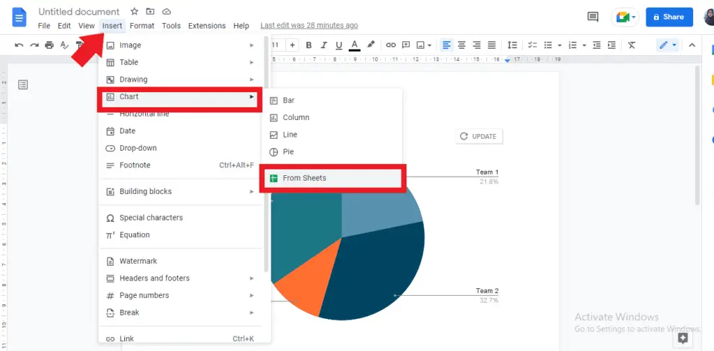
2. When your document is ready, you need to find the “Insert” in the menu and click on it to open the drop-down menu. In the drop-down menu, drag your cursor and place it on the “chart”.
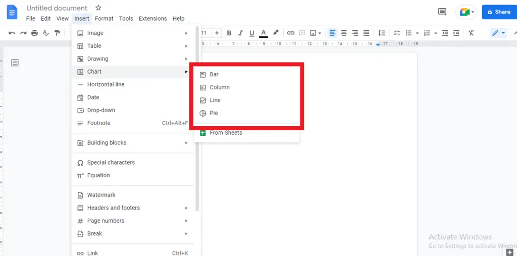
3. There you will see a sidebar menu that comes up with some options that you might apply for creating a graph such as a bar, column, line, or pie graph.
4. Selecting one of the options in the sidebar menu will be automatically inserted in your document. Hence, you are able to do editing the graph as needed. Let’s say you choose “pie”, and then you will see the pie graph in your document as follows:
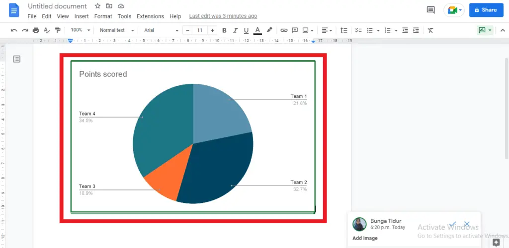
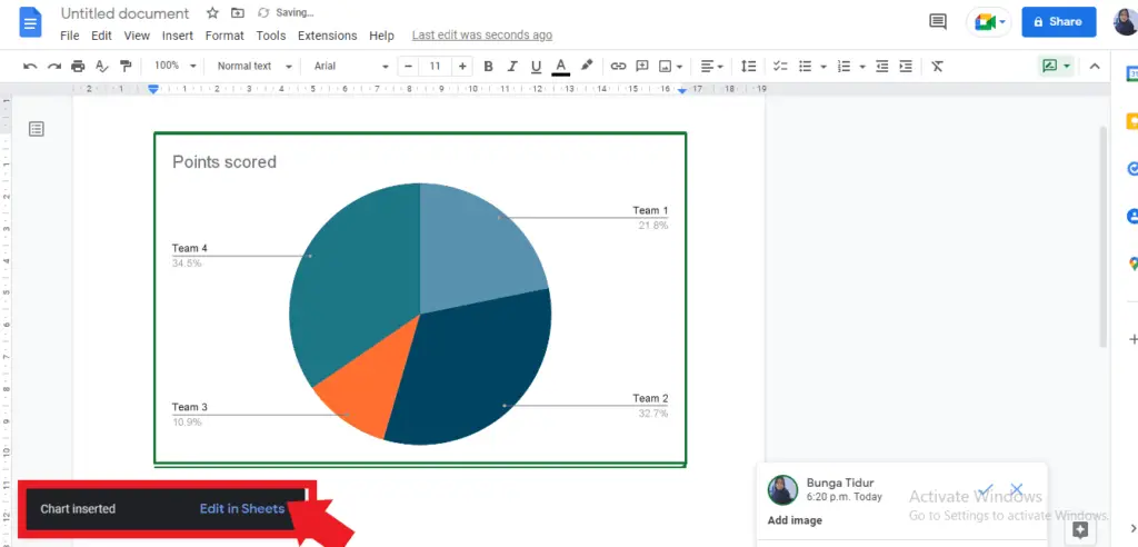
5. Having inserted the graph, you can start editing the entries or data that you need to visualize. To do editing, find “edit in Sheets” in the pop-up menu that appears at the bottom left of the screen and click on it to open the link options.
6. Once the Google sheets have been opened, you can start customizing your graph by changing the background, fonts, lines, opacity, and shapes. You can find the option by doing the “Right-clicking” chart in your spreadsheets.
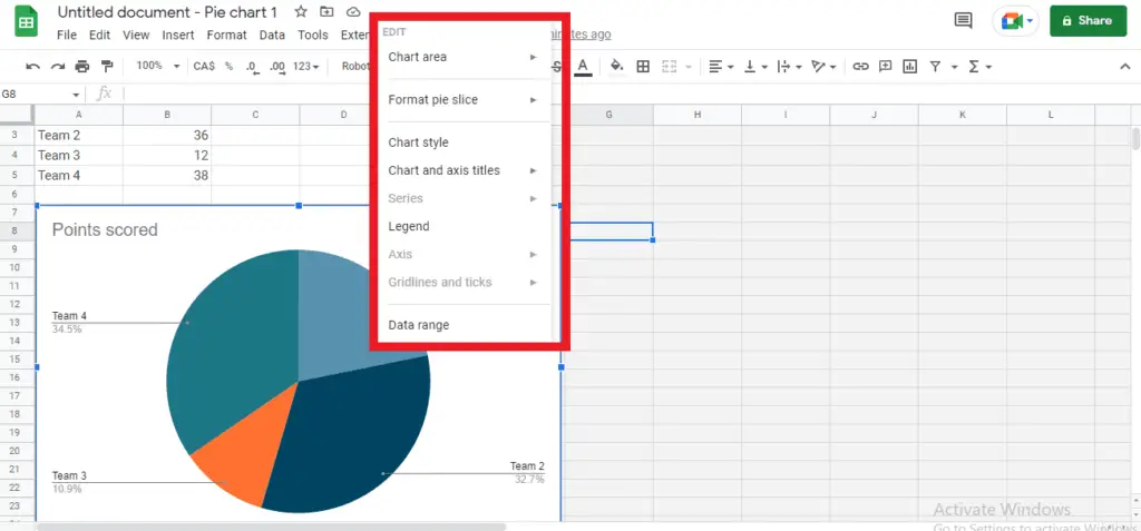
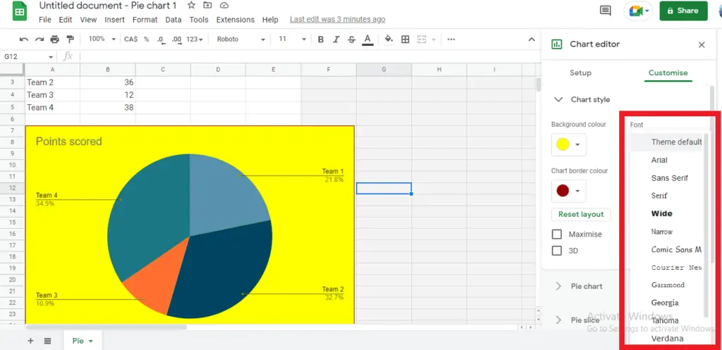
7. You can select “Chart Style” to change the background color.
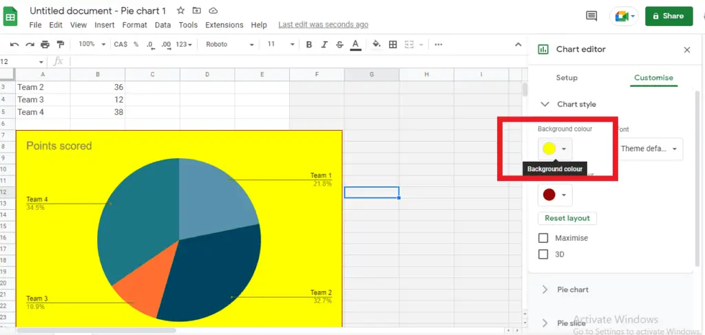
8. You are also able to change the “font style” as you need.
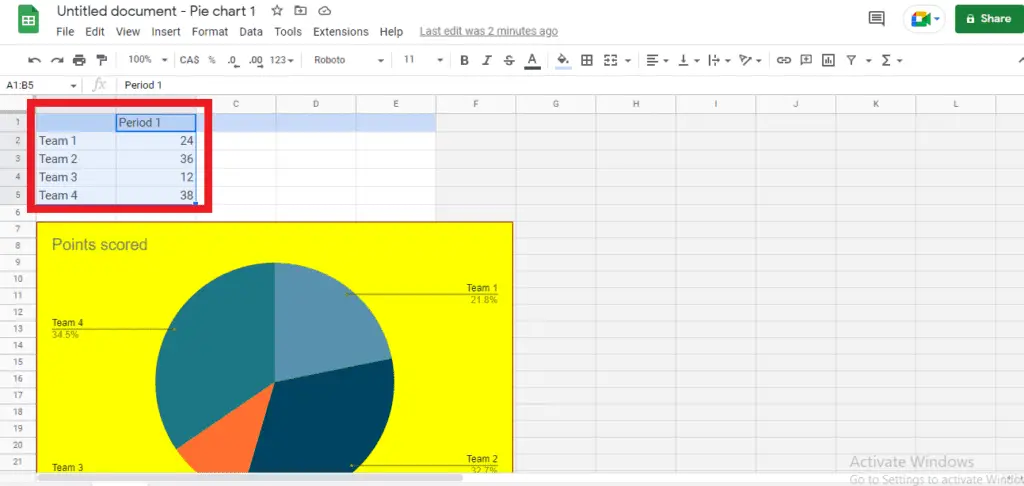
9. To update the data or the entries in your graph, you can simply edit the cells that contain the information. By changing the information, the data in your graph will be automatically updated.
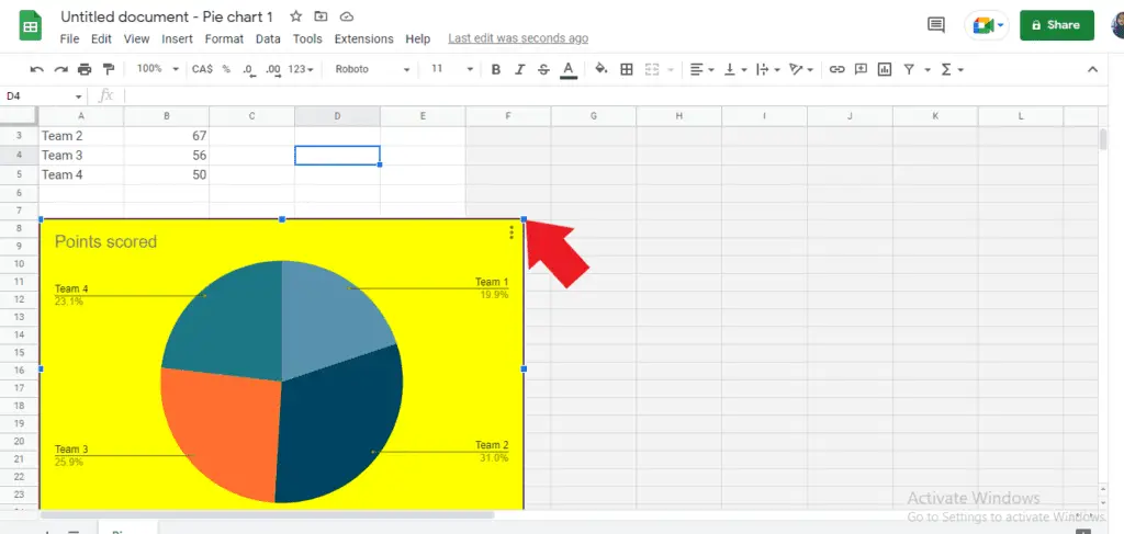
10. If you need to resize or even rotate your graphs, you can select the item to show the blue border boxes and drag a corner inward or outward to make the graph smaller or larger.
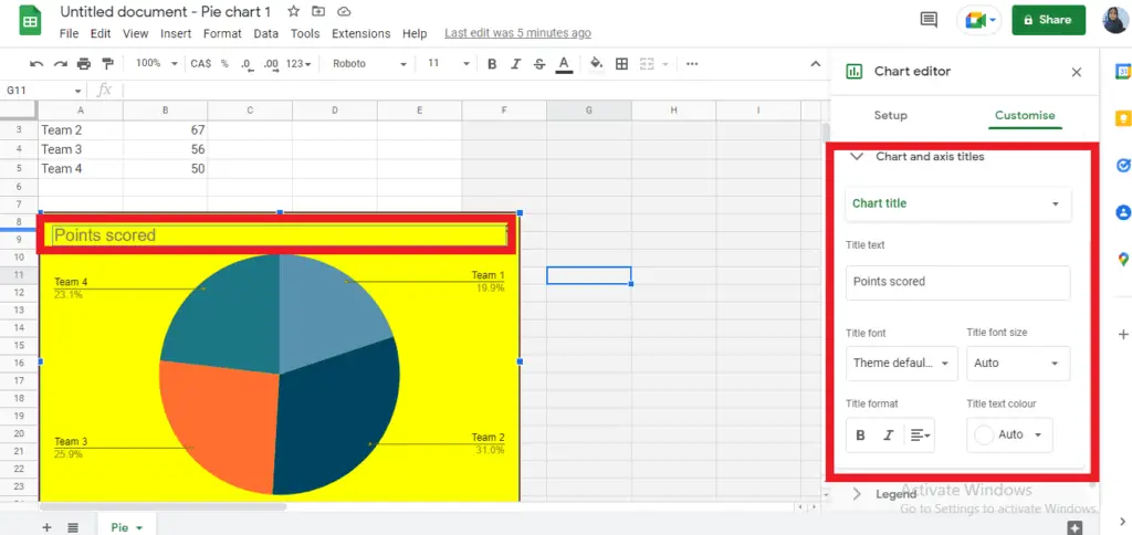
11. Doing “double-click” on the title will bring you to the “chart and axis title”. There you can change the title, the font, the format, and the color as you prefer.
12. Once every data has been updated, you can go back to the “insert” menu and “chart” tab on google docs and click on “From sheets”
13. Select the sheet graph that you want to insert and click “Import”.
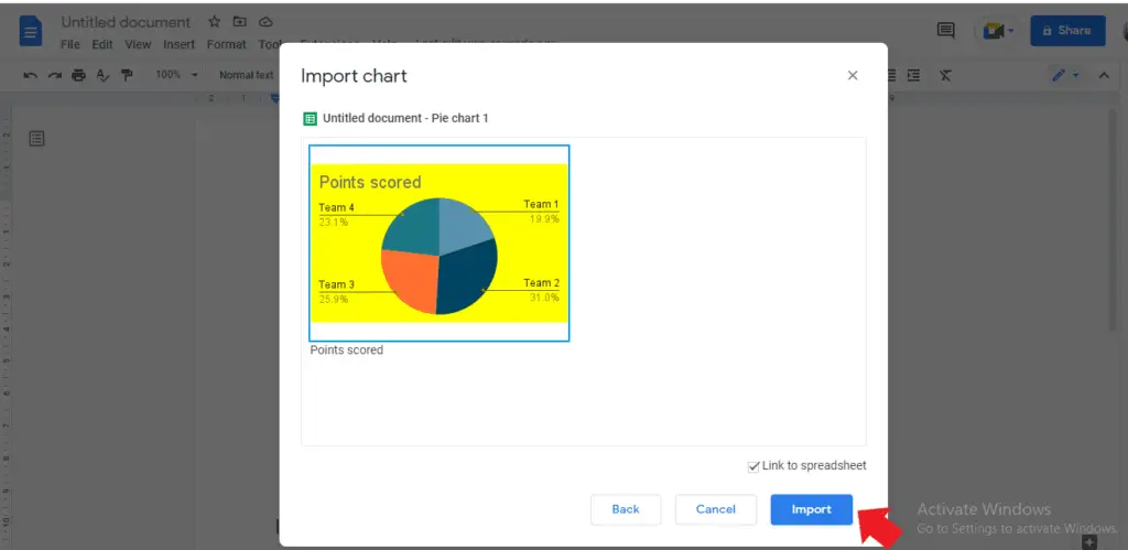
The new graph will be inserted into your document. You can remove the previous graph in your Google docs by simply pressing “delete” on your keyboard.


