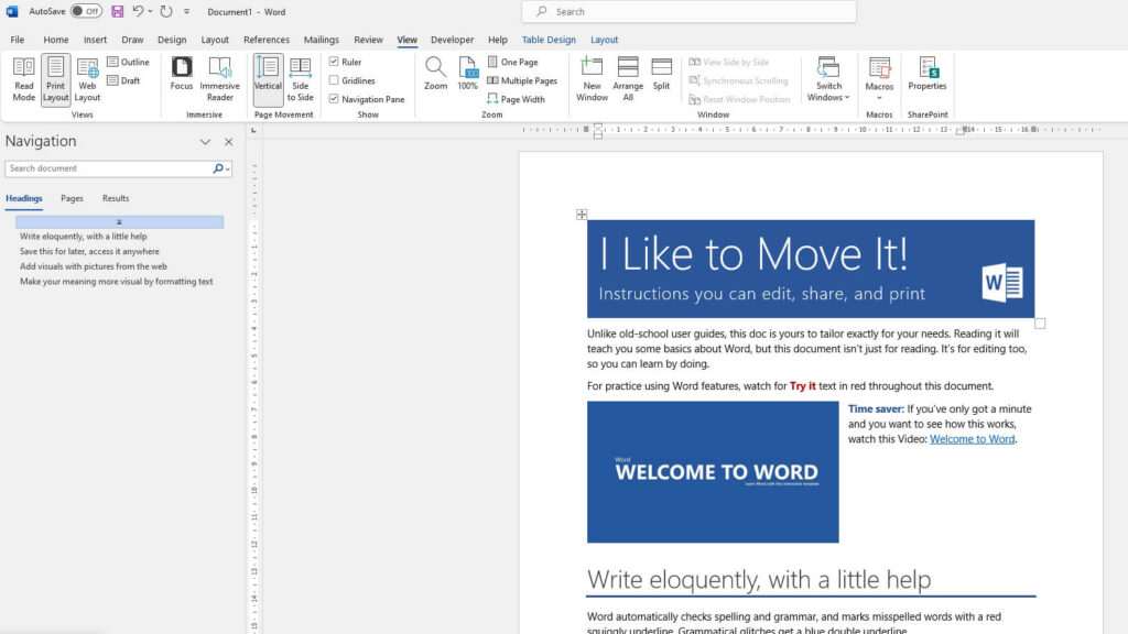
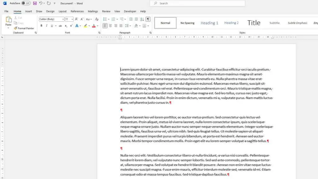
Kerning refers to the spacing between individual letters and characters. It adjusts the space between certain letter pairs to improve readability and make text more visually appealing. Learning how to properly kern text can greatly enhance the aesthetics and readability of your Word documents.
What is Kerning?
Kerning is the process of adjusting the space between characters in a font, changing the default spacing between letters. The goal of kerning is to create a uniform appearance so that certain letter combinations fit together in a more visually pleasing way.
For example, an uppercase “T” next to an uppercase “O” may have too much space between them. Kerning would reduce that space to make it look better and more readable. Some common letter pairs that typically need kerning adjustments are:
- Ta
- Te
- To
- Tr
- Ty
- Wa
- We
- Wo
- Ya
- Yo
Without kerning, these letter combinations and many others can look awkwardly spaced. The overall readability and visual balance of text can suffer.
Why Adjust Kerning?
There are several reasons why you may want to adjust kerning in Word:
- Improves aesthetics – With proper kerning, text looks more uniform and professional. It creates a cleaner, more balanced appearance.
- Enhances readability – Adjusting space between letters enhances visual flow and makes text easier to read. Well-kerned text helps guide the eye naturally across lines.
- Allows customization – Manually changing kerning gives you artistic license to create special visual effects. Condensing or expanding space between letters provides unique styling options.
In summary, kerning makes text more visually appealing and easier to read. It gives you control over the look of fonts for personalized documents tailored to your needs.
How to Enable Automatic Kerning in Word
The easiest way to quickly improve kerning in Word is to turn on the automatic kerning feature. Here’s how:
- Select the text you want to kern.
- Open the Font dialog box by going to Home > Font or using the keyboard shortcut Ctrl + D.
- Click on the Advanced tab.
- Check the box next to “Kerning for fonts”. Kerning for fonts checkbox
- Specify the minimum font size for which you want kerning enabled. 10 pt is a good starting point. Set minimum font size for kerning
- Click OK.
Automatic kerning will now be applied to the selected text at the specified minimum size. This default kerning is controlled by the font’s internal kerning tables.
The minimum font size ensures kerning is only applied when text is large enough to benefit – kerning tiny text is usually unnecessary.
💡 Tip: Apply kerning at the end of the editing process in case you change text size later on. Kerning settings apply only to the active Word document.
How to Manually Adjust Kerning
For more control, you can manually change the spacing between letters using the “Expanded” and “Condensed” kerning options:
- Select the text you want to adjust.
- Open the Font dialog box using Ctrl + D.
- Go to the Advanced tab.
- Choose either “Expanded” or “Condensed” spacing: Expanded and Condensed kerning options
- Expanded – Increases space between all letters in selected text
- Condensed – Decreases space between all letters in selected text
- Specify the amount you want to expand or condense in the input field, ranging from 0.1 pt to 600 pt. Set amount to expand or condense kerning
- Click OK to apply the changes.
This expands or condenses spacing for all letters by the specified amount. Positive values expand while negative values condense.
You’ll need to experiment to find the ideal spacing for the selected font and text size. Subtle changes between 2 pt and 10 pt are usually most effective for manual kerning.
Advanced Kerning Techniques
Manually adjusting kerning between specific letter pairs gives you extra artistic freedom to create special visual effects.
Kerning Individual Letter Pairs
- Select the first character in the letter pair you want to kern.
- Open the Font dialog box using Ctrl + D.
- Go to the Advanced tab and choose “Expanded” or “Condensed”.
- Enter a positive or negative amount to increase/decrease spacing.
- Click OK. The adjustment is only applied between that character and the next character.
Repeat steps 1-5 for each letter pair you want to fine-tune. This lets you manually optimize spacing for certain combinations only.
Creating Stylistic Effects
Creative use of expanded/condensed kerning enables unique visual treatments. For example:
- Tightly condensing the space in company names or titles conveys boldness and strength
- Subtly expanding spacing in a poem creates a dreamy, ethereal effect
- Tightening line spacing and condensing kerning conveys intensity and urgency
- Exaggerating kerning between all letters spreads out text for impact
Don’t be afraid to really exaggerate manual kerning for headings and small bursts of text. The more extreme the adjustment, the more pronounced the visual effect.
Kerning Tips and Best Practices
Follow these tips when adjusting kerning in Word for best results:
- Only apply kerning adjustments after finalizing font selection and text size. Changing the font or scale later may undo your careful spacing tweaks.
- Be conservative with body text. Only expand or condense by up to 10 pt for paragraphs. More extreme adjustments decrease readability.
- Kern display text more aggressively for headlines, logos, posters etc. Wider adjustments are better tolerated at large sizes.
- Avoid condensing text so tightly that letters bump together or overlap. This greatly reduces legibility.
- Don’t kern extremely small text under 8 pt. There are usually no noticeable improvements.
- Manually check spacing for letter combinations like “WA”, “Ta”, and “Yo” which typically need adjustment.
- Print a copy to double check spacing tweaks. What looks good on screen may need further refinement on paper.
Before and After Kerning Examples
Seeing proper kerning in action showcases the visual improvements possible in Word.
Here is text before and after applying some manual kerning adjustments:
No Kerning Applied
Before kerning example
With Advanced Kerning
After kerning example
Notice how condensing the “WA” and “TA” letter pairs helps align the spacing. The text looks cleaner and more balanced with kerning applied.
Achieve Visual Harmony with Kerning
Adjusting kerning may seem tedious, but is worth the effort. Well-kerned text is easier to read and looks far more professional.
Following the tips in this tutorial, you can now harness the power of both automatic and manual kerning. Go ahead, spread your typographic wings and visually enhance text in Word today!


